Evidence for a solar signature in 20th-century temperature data from the USA and Europe
←
→
Transcription du contenu de la page
Si votre navigateur ne rend pas la page correctement, lisez s'il vous plaît le contenu de la page ci-dessous
+ Models
CRAS2A-2754; No of Pages 10

                                                C. R. Geoscience xxx (2008) xxx–xxx
                                                                                                 http://france.elsevier.com/direct/CRAS2A/

                                    External Geophysics, Climate and Environment
           Evidence for a solar signature in 20th-century temperature
                        data from the USA and Europe
           Jean-Louis Le Mouël, Vincent Courtillot *, Elena Blanter, Mikhail Shnirman
     Geomagnetism and Palaeomagnetism, institut de physique du Globe de Paris, BP 89, 4, place Jussieu, 75252 Paris cedex 05, France
                                       Received 24 October 2007; accepted after revision 2 June 2008

                                                          Presented by Claude Jaupart

Abstract
    We analyze temperature data from meteorological stations in the USA (six climatic regions, 153 stations), Europe (44 stations,
considered as one climatic region) and Australia (preliminary, five stations). We select stations with long, homogeneous series of
daily minimum temperatures (covering most of the 20th century, with few or no gaps). We find that station data are well correlated
over distances in the order of a thousand kilometres. When an average is calculated for each climatic region, we find well
characterized mean curves with strong variability in the 3–15-year period range and a superimposed decadal to centennial (or
‘secular’) trend consisting of a small number of linear segments separated by rather sharp changes in slope. Our overall curve for the
USA rises sharply from 1910 to 1940, then decreases until 1980 and rises sharply again since then. The minima around 1920 and
1980 have similar values, and so do the maxima around 1935 and 2000; the range between minima and maxima is 1.3 8C. The
European mean curve is quite different, and can be described as a step-like function with zero slope and a 1 8C jump occurring in
less than two years around 1987. Also notable is a strong (cold) minimum in 1940. Both the USA and the European mean curves are
rather different from the corresponding curves illustrated in the 2007 IPCC report. We then estimate the long-term behaviour of the
higher frequencies (disturbances) of the temperature series by calculating the mean-squared interannual variations or the ‘lifetime’
(i.e. the mean duration of temperature disturbances) of the data series. We find that the resulting curves correlate remarkably well at
the longer periods, within and between regions. The secular trend of all of these curves is similar (an S-shaped pattern), with a rise
from 1900 to 1950, a decrease from 1950 to 1975, and a subsequent (small) increase. This trend is the same as that found for a
number of solar indices, such as sunspot number or magnetic field components in any observatory. We conclude that significant
solar forcing is present in temperature disturbances in the areas we analyzed and conjecture that this should be a global feature. To
cite this article: J.-L. Le Mouël et al., C. R. Geoscience xxx (2008).
# 2008 Académie des sciences. Published by Elsevier Masson SAS. All rights reserved.

Résumé
    Sur une signature solaire dans les données de température recueillies au XXe siècle en Europe et aux États-Unis. Des
données de température en provenance de stations météorologiques des États-Unis (six zones climatiques, 153 stations), d’Europe
(44 stations considérées comme appartenant à une unique zone climatique) et d’Australie (étude préliminaire, cinq stations) ont été
analysées. Les stations disposant de longues séries de températures journalières (recouvrant la plus grande partie du XXe siècle,
avec peu ou pas d’interruptions) ont été sélectionnées. Il a été trouvé que les données de stations sont bien corrélées sur des distances
de l’ordre du millier de kilomètres. Quand une moyenne est calculée pour chaque région climatique, on observe des courbes

 * Corresponding author.
   E-mail address: courtil@ipgp.jussieu.fr (V. Courtillot).

1631-0713/$ – see front matter # 2008 Académie des sciences. Published by Elsevier Masson SAS. All rights reserved.
doi:10.1016/j.crte.2008.06.001

 Please cite this article in press as: J.-L. Le Mouël et al., Evidence for a solar signature in 20th-century temperature data from the
 USA and Europe, C. R. Geoscience (2008), doi:10.1016/j.crte.2008.06.001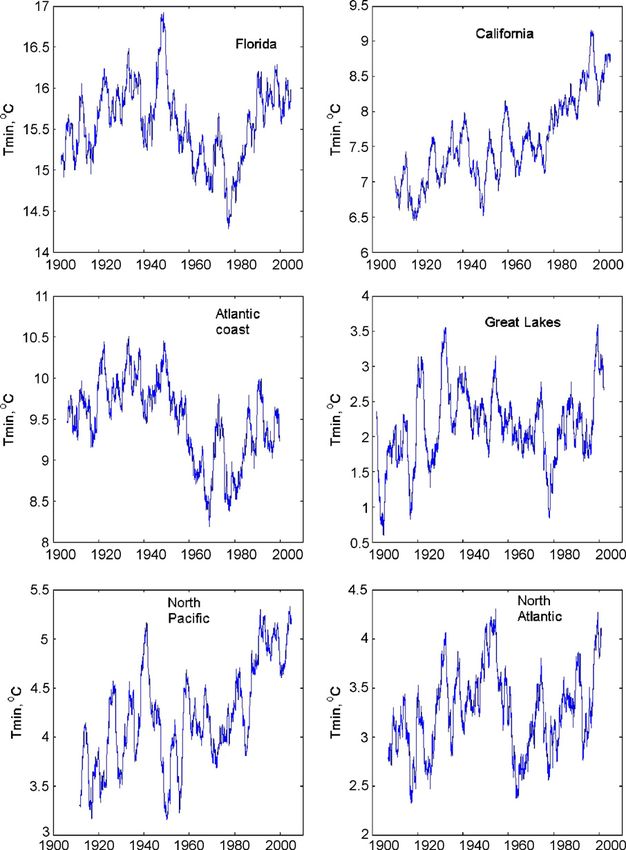
+ Models
CRAS2A-2754; No of Pages 10

2                                         J.-L. Le Mouël et al. / C. R. Geoscience xxx (2008) xxx–xxx

moyennes bien caractérisées, avec une variabilité prononcée dans la fourchette 3–15 ans, et une tendance superposée avec des
constantes de temps de l’ordre de la décennie au siècle, qui consiste en un petit nombre de segments linéaires séparés par des
changements de pente assez aigus. La courbe d’ensemble pour les États-Unis croît nettement de 1910 à 1940, puis décroît jusqu’en
1980, et ensuite croît à nouveau nettement. Les minima autour de 1920 et 1980 présentent des valeurs similaires, de même que les
maxima autour de 1935 et 2000 ; l’écart entre minima et maxima est de 1,3 8C. La courbe moyenne pour l’Europe est très différente,
et peut être décrite comme une fonction en escalier, avec une pente nulle et un saut d’environ 1 8C en moins de deux ans autour de
1987. Un minimum (froid) prononcé est aussi observable en 1940. Les courbes moyennes pour les États-Unis et l’Europe sont assez
différentes des courbes correspondantes fournies par le rapport GIEC de 2007. Nous estimons alors le comportement à long terme
des fréquences plus hautes (perturbations) des séries de température, en calculant les variations quadratiques moyennes
interannuelles ou « durée de vie » (c’est-à-dire la durée moyenne des perturbations de température) des séries de données.
Les courbes résultantes sont remarquablement bien corrélées sur de longues périodes entre régions et à l’intérieur des regions et
entre régions. La tendance séculaire de toutes ces courbes est similaire (allure en S), avec une croissance de 1900 à 1950, une
décroissance de 1950 à 1975 et une augmentation (faible) ensuite. Cette tendance est la même que celle trouvée pour différents
indices solaires, tels que le nombre de taches solaires ou les composantes du champ magnétique dans un observatoire. Nous
concluons à un forçage solaire significatif dans les perturbations de température pour les zones analysées ici et avançons que cette
situation pourrait avoir un caractère global. Pour citer cet article : J.-L. Le Mouël et al., C. R. Geoscience xxx (2008).
# 2008 Académie des sciences. Published by Elsevier Masson SAS. All rights reserved.

Keywords: 20th-century temperature data (USA, Europe, Australia); Disturbances; Mean-squared interannual variations; Solar indices; Solar
forcing; Geomagnetic field

Mots clés : Données de température pour le XXe siècle (États-Unis, Europe, Australie) ; Perturbations ; Variations quadratiques moyennes
interannuelles ; Indices solaires ; Forçage solaire ; Champ géomagnétique

1. Introduction                                                               An item for discussion, which we wish to emphasize,
                                                                           rests with actual temperature measurements and the way
   Although a proper description of climate change                         global average temperatures are derived. Whereas there
cannot be based on temperature alone, temperature is                       are a rather large number of groups around the world
often considered a useful index and is readily grasped                     studying the physical and chemical processes that affect
by the general public. As a result, temperature curves                     climate and testing and inter-comparing numerical
are often the main data displayed in papers or reports                     models (GCMs), the number of independent analyses
readily accessible to the public and to policymakers. To                   of mean temperature data is not so large. Two main
give just a few recent examples, a special issue of Pour                   groups are involved in assembling a global data base of
la Science dedicated to global warming featured a paper                    mean temperatures, one in the UK and one in the USA. A
by Moisselin and Dubuisson [15] on warming in France                       new data set from 1850 to the present day has been
that started with a figure displaying the mean variations                  assembled by the Hadley Research Centre and is
in temperature in metropolitan France from 1901 to                         described in Brohan et al. [4]. The paper focuses usefully
2005, whereas a paper by Le Treut [14] on modelling                        on uncertainty estimates and provides curves for mean
‘‘certainties and uncertainties’’ displayed the famous                     temperature change from 1850 to 2005. Uncertainties in
hockey-stick curve (basically the version from Mann,                       recent decades are claimed to be in the order of 0.15 8C
see for instance Jones and Mann, [11]) over the past                       for the global land average, 0.10 8C for the marine
1000 years. The Summary for policymakers of Working                        average. Corresponding values in the second half of the
Group 1 (part of its contribution to the IPCC Fourth                       19th century are 0.40 8C and less than 0.15 8C.
Assessment Report, [10]) displays variations of the                        Because the surface covered by the oceans is two-thirds
global average temperature from 1850 to 2005. One of                       of the globe, the marine data dominate the final global
the concluding figures (SPM-4) displays changes in the                     average, which has an uncertainty of less than 0.10 8C in
continental and global-scale decadal surface air-                          recent decades and less than 0.15 8C in the last half of the
temperature anomalies for 1906–2005, measured                              19th century. This is the curve used in IPCC WG1 ([10],
relative to the corresponding averages for the 1901–                       Figure SPM-3).
1950 period, and compared with model simulations.                             Global averages, which are derived from raw data in
Observations diverge from model simulations, starting                      the Hadley Research Centre database, are faced with the
around the mid-1970s, when greenhouse gases are not                        problems of large temporal changes in data distribution,
included.                                                                  and to a lesser extent quality. The marine data in

    Please cite this article in press as: J.-L. Le Mouël et al., Evidence for a solar signature in 20th-century temperature data from the
    USA and Europe, C. R. Geoscience (2008), doi:10.1016/j.crte.2008.06.001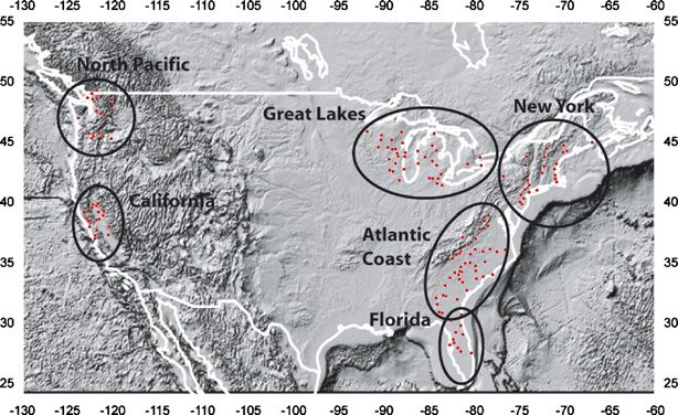
+ Models
CRAS2A-2754; No of Pages 10

                                       J.-L. Le Mouël et al. / C. R. Geoscience xxx (2008) xxx–xxx                                            3

particular have been obtained using various bucket and                  To get much of the NMS data, the centre has signed
thermometer techniques and automated engine cooling-                    agreements with NMSs saying they would not pass the
water observations made from ships. Moreover,                           raw data onto third parties.’’ Also, there is apparently no
measurements are not made at the same instants, of                      access to daily data (only monthly means). Being used
course. Marine data are assigned their local time,                      to collecting and processing worldwide magnetic data,
whereas for land data the mean of the maximum and                       we are quite sympathetic with these difficulties. The
minimum daily temperatures is used. These mean daily                    database would therefore have to be reconstructed step
values (in the case of continental measurements) or                     by step from original observatory publications or partial
instantaneous values (in the case of marine data) are                   databases and websites.
averaged over one month in a 58 square spherical cap,                      We have given ourselves the more modest objective
and the 1961–1990 mean is subtracted to define the                      to use regional data bases, starting with 153 US and 44
temperature anomaly. Finally, adjustments are made to                   European observatories, where we could obtain
reduce the effects of land-use changes, changes in                      essentially a century of daily (rather than monthly;
instruments, measurement site and missing data.                         this may be quite important, as will be seen below) data
Clearly, the amount of work involved in acquiring,                      (minimum, mean and maximum temperatures). We
collecting, analyzing, reducing these 3.7 million data is               have analyzed individual station data and averages at
enormous and cannot easily be redone or checked                         the regional and continental scales. We focused on long-
independently.                                                          term variations evidenced after 3-year averaging of the
    We find it quite remarkable that the claimed                        data, in order to eliminate the large annual cycle. We
uncertainties can be so small back to 1850. The marine                  then looked for an index that would allow us to estimate
data are the focus of a specific paper by Rayner et al. [16].           long-term variations of the characteristics of higher
Both Rayner et al. [16] and Brohan et al. [4] discuss in                frequencies (disturbances) in the signal, attempting to
detail the changes in the measurement techniques over                   diminish the otherwise large effect of the annual
these 150 years. Prior to 1900, the total number of                     variation. We have used both a rather classical tool, the
observations was less than 5% of the number of data after               mean-squared interannual variation, and a more novel
2000 and less than 15% of the number of data after 1950.                nonlinear filtering technique involving the ‘lifetime’ of
Moreover, the number of 58 square boxes with any data                   temperature curves (which is described in more detail in
(yielding monthly averages) prior to 1900 was less than                 Le Mouël et al., 2008, a description not needed at the
50% of the number of data after 1950. Before 1900, two                  stage of this paper).
thirds of the total oceanic surface had no data. It is quite
remarkable that this enormous under-sampling hardly
affects the uncertainties of the global temperature curves.
P. Jones (pers. comm., 2007) informed us that attempting
to reconstruct the global temperature means using post-
1950 data, under-sampled in the way the pre-1900 data
were distributed, hardly changed the global means. This
would imply that the marine mean air surface
temperature is a remarkably uniform field on the global
scale.
    We have not been able so far to obtain the files of data
used by Brohan et al. [4], i.e. the actual monthly data in
each 58 box prior to any processing, including
computation of the ‘temperature anomaly’. P. Jones
(pers. comm., 2007) writes, quite understandably, that
                                                                        Fig. 1. Climatological stations and climatic regions of the USA used
‘‘the aim with the global temperature grids and time                    for calculating regional averages. The numbers of stations used are 17
series is to make the data easy for scientists to use’’, but            for the North Pacific, 37 for the Great Lakes, 25 for the North Atlantic
that ‘‘the monthly station data are not available. They                 (New York), 20 for California, 45 for the Atlantic Coast and 9 for
have been routinely obtained from the Global Tele-                      Florida.
communication System between national meteorologi-                      Stations climatologiques et régions climatiques des États-Unis uti-
                                                                        lisées pour calculer les moyennes régionales ; nombre de stations : 17
cal services (NMSs). They have been augmented over                      pour le Pacifique Nord, 37 pour les Grands Lacs, 25 pour l’Atlantique
the years using data received from NMSs around the                      Nord (New-York), 20 pour la Californie, 45 pour la côte atlantique et 9
world and from scientists working in the climate field.                 pour la Floride.

 Please cite this article in press as: J.-L. Le Mouël et al., Evidence for a solar signature in 20th-century temperature data from the
 USA and Europe, C. R. Geoscience (2008), doi:10.1016/j.crte.2008.06.001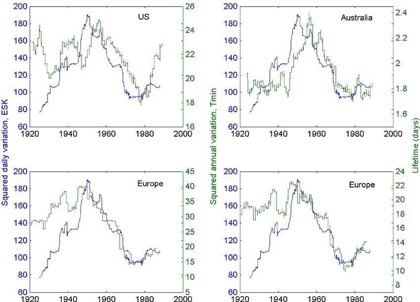
+ Models
CRAS2A-2754; No of Pages 10

4                                         J.-L. Le Mouël et al. / C. R. Geoscience xxx (2008) xxx–xxx

   We first discuss the results for North America, where                     preliminary results from five Australian stations. In a
we illustrate changes in minimum temperature and                             final section, we discuss implications of our findings
temperature disturbances over six climate zones centred                      with respect to potential driving forces of climate
on the North Atlantic coast, the Great Lakes, the central                    change.
US Atlantic coast, Florida, California and the North
Pacific coast. We show that there is a quite significant                     2. North American temperatures
correlation between long-term variations in temperature
disturbances and indices related to long-term changes                          The data from 153 stations in North America (Fig. 1)
in solar activity. We then repeat the analysis for                           were analyzed. The data are extracted from the
European stations, the detailed results being described                      ECA&ECD database (available via http://eca.knmi.nl/).
elsewhere (Le Mouël et al., [13]). We also present some                      They consist in series of daily minimum, mean and

Fig. 2. Three-year running mean minimum temperature curves for the six USA climatic zones shown in Fig. 1.
Courbes moyennes de température minimale journalière moyennée sur trois ans pour les six zones climatiques des États-Unis, indiquées sur la Fig. 1.

    Please cite this article in press as: J.-L. Le Mouël et al., Evidence for a solar signature in 20th-century temperature data from the
    USA and Europe, C. R. Geoscience (2008), doi:10.1016/j.crte.2008.06.001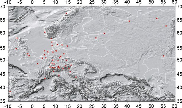
+ Models
CRAS2A-2754; No of Pages 10

                                         J.-L. Le Mouël et al. / C. R. Geoscience xxx (2008) xxx–xxx                                     5

maximum temperature values. In the present paper,                         between the situation in the 1930s and at present. A
we only show results for minimum temperatures in                          North American mean temperature curve is given in
stations with the shortest possible gaps; the other two                   Figure SPM-4 of the Working Group 1, part of the IPCC
yield rather similar results. Based on analysis of                        Fourth Assessment Report [10]. We note that this curve
individual station data and previous definitions of                       and ours are quite different. The overall increase from
climate zones on the continent (e.g., Groisman and                        the beginning to the end of the 20th century is very
Easterling, [8]), we have used six distinct zones, for                    significant in Figure SPM-4, but is found only in our
which the time evolutions of (3-year-averaged) tempera-                   western US regional curves (Fig. 2), not in the overall
tures are shown in Fig. 2. Whereas the spectral content                   mean (Fig. 3). The two curves are based on somewhat
of all series in the 3–15-year period range is similar and                different sets of data with very different resolution: one
some correlations can be noticed between adjoining                        data point every ten years based on monthly averages
climate zones, the longer-term (decadal to secular)                       for Figure SPM-4, vs. daily data with 3-year running
trends are clearly very different from one zone to the                    mean filtering in our case. Yet, we do not see how these
other. California displays a continuously increasing                      can be so different and wonder about the resolution and
temperature trend, which can be broken down in three                      significance of the curves in the IPCC report [10].
periods, two with a faster rise (1910–1940 and 1980 to
the present) and one with a smaller average slope (1940–                  3. Secular evolution of temperature disturbances
1980). The North Pacific has similar features with                        in North America
larger amplitude and a significant decrease after 1940.
The Great Lakes display a jagged, zigzag-like trend,                          When attempting to find long-term correlations, and
rising until 1935, decreasing to 1975 and rising since.                   possibly causal connections between observables linked
The North Atlantic coastal area displays a sharp rise until               to the climate system (here temperature) and potential
the early 1950s, a strong cooling between 1950 and 1960.                  driving factors (anthropogenic GHG, Sun, cosmic
On the other hand, in the Central Atlantic coast and                      rays. . .), only the longer periods are relevant if the
Florida regions, the zigzag-shaped curves and their most                  system is a linear one. But if it is nonlinear and
recent warming segments yield to a plateau when                           moreover turbulent, cascades from the higher to the
temperatures stabilize, as of 1985.                                      lower frequencies or the reverse can occur. In that sense,
    The overall mean curve for 153 stations is shown in                   it is important to estimate the long-term behaviour of
Fig. 3. It displays three main periods, two with a sharp                  the higher frequencies (disturbances), a delicate task
rise between 1910 and 1935, and between the late 1970s                    with many time series spanning several orders of
and the present. This is interrupted by a long cooling                    magnitude in characteristic frequencies. In previous
period from 1930 to the late 1970s. Note that the slope                   papers, we have used a nonlinear technique of analysis
and value reached in the most recent episode are no                       developed for time series whose complexity arises from
larger than in the one preceding 1940, and that the                       interactions between different sources over different
warmest temperatures may have been around 1930, as                        time scales. We have applied this technique to several
recently noted by the US weather service. There is                        geophysical time series [1,2,6]. In Le Mouël et al. [13],
therefore great similarity in the US (taken as an average)                we apply it to European temperature time series and to
                                                                          several indicators of solar activity. The technique allows
                                                                          us to extract the ‘lifetime’ of (higher frequency) features
                                                                          from a time series (i.e. roughly the mean duration of
                                                                          temperature disturbances), and then to follow the time
                                                                          evolution of this higher-frequency component on the
                                                                          longer time scales. A more classical technique consists
                                                                          in computing simply the mean squared interannual
                                                                          variation, which is:
                                                                                  X
                                                                          ð1=TÞ        ðFðt þ dDtÞFðtÞÞ2                         (1)
Fig. 3. Overall mean curve (three-year running mean minimum
                                                                          with an offset dDt = 365 days, in order to suppress the
temperature in ˚C) for the 153 USA stations shown in Fig. 1.
Courbe moyenne d’ensemble (température minimale moyenne sur               overwhelming effect of Earth’s annual orbit around
trois ans en ˚C) pour les 153 stations des États-Unis indiquées sur       the Sun, and an averaging interval T = 22  365 days,
la Fig. 1.                                                                in order to eliminate signals directly related to the solar

 Please cite this article in press as: J.-L. Le Mouël et al., Evidence for a solar signature in 20th-century temperature data from the
 USA and Europe, C. R. Geoscience (2008), doi:10.1016/j.crte.2008.06.001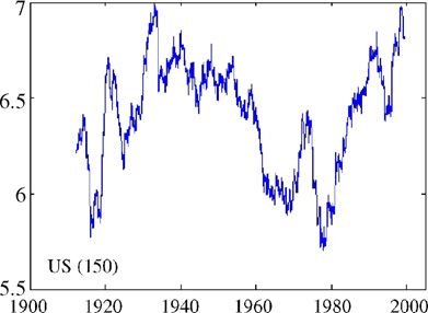
+ Models
CRAS2A-2754; No of Pages 10
6 J.-L. Le Mouël et al. / C. R. Geoscience xxx (2008) xxx–xxx
(and magnetic solar) cycle(s). Our experience with the case dDt = 1 day in Eq. (1)) of the vertical component
two methods is that they often generate similar results, Z of the magnetic field at Eskdalemuir (shown in blue
even though in some cases the more elaborate techni- in all sections of the figure). The overall S shape of
que of lifetimes yields sharper results. We have used the the curves, with an increase up to 1950, then a decrease
mean squared interannual variation for US stations until the 1970s, followed by (rather small) growth
(although we do show results with the lifetime in the since then, is common to most curves. This overall
case of European stations in the next section). Results correlation fails prior to 1930 in the North Atlantic
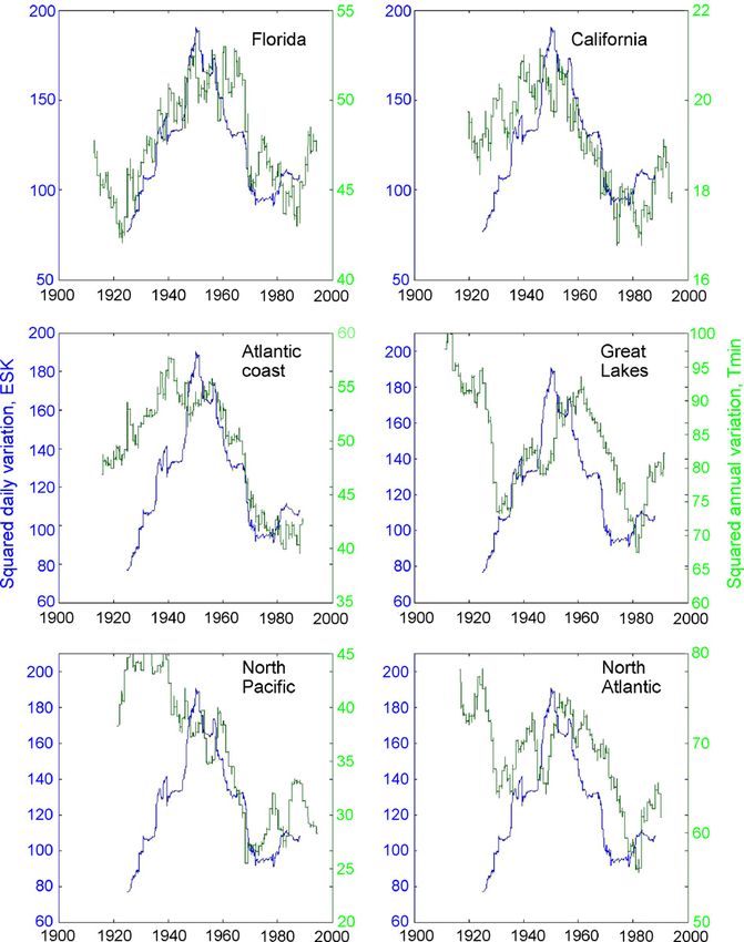
are given in Fig. 4. We have selected as a proxy for and Great Lakes regions, and prior to 1945 in the North
solar activity the mean squared daily variation (in that Pacific.
Fig. 4. Mean-squared interannual variations (22-year averaged) of minimum temperature for the six USA climatic zones shown in Fig. 1 (green
curves), compared to a magnetic index representing solar activity (the squared daily variation of the vertical component Z of the geomagnetic field at
Eskdalemuir; blue curve).
Variations quadratiques moyennes interannuelles (moyennées sur 22 ans) de la température minimale pour les six zones climatiques des États-Unis
indiquées sur la Fig. 1 (courbes vertes) comparées à un indice magnétique représentant l’activité solaire (variation quadratique interjournalière de
la composante verticale Z du champ géomagnétique à Eskdalemuir : courbe bleue).
Please cite this article in press as: J.-L. Le Mouël et al., Evidence for a solar signature in 20th-century temperature data from the
USA and Europe, C. R. Geoscience (2008), doi:10.1016/j.crte.2008.06.001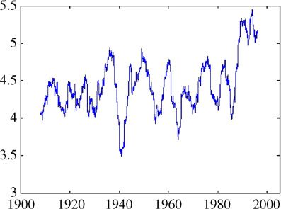
+ Models
CRAS2A-2754; No of Pages 10

                                        J.-L. Le Mouël et al. / C. R. Geoscience xxx (2008) xxx–xxx                                      7

                                                                         temperature rise by almost 1 8C in 1987. Going back
                                                                         to the original station data, these two features are
                                                                         indeed found almost ubiquitously, though they become
                                                                         more pronounced with increasing averaging over the
                                                                         continent. We conclude from this curve that there was
                                                                         indeed warming in the 20th century in Europe, but that
                                                                         the characteristics of this warming are different from
                                                                         those shown again in Figure SPM-4 of Working Group
                                                                         1, part of the IPCC Fourth Assessment Report [10].
                                                                         There was almost no regional change in temperature
                                                                         between 1900 and 1987 and since then (although the
                                                                         series is a bit short to evaluate significantly the post-
Fig. 5. Geographical distribution of 44 European climatological
stations used in this study (see also [13]).
                                                                         1987 trend; this is confirmed by the most recent and
Répartition géographique des 44 stations climatologiques européen-       complete station data sets). Most temperature extremes
nes utilisées dans cette étude (voir aussi [13]).                        of the 20th century have been reached in the past 20
                                                                         years, due to the superimposition of the 0.5 8C
                                                                         amplitude higher frequency changes (5–15-year period
4. European temperatures                                                 range) and the 1 8C step-like jump in 1987. The trend
                                                                         in the mean temperature in Europe has been essentially
   We have next analyzed (3-year running average)                        flat before and after 1987. The change occurred in an
daily minimum temperature curves from 44 European                        astonishingly short time and the situation appears to be
climatological stations (Fig. 5) covering most of the past               stable since. That short intense events correlated at the
century. All individual station curves again display                     continental scale can occur is well illustrated by the
significant energy in the 3–15-year period range and                     extreme cold event of 1940, which has no other
correlate quite well, and so do country averages and the                 equivalent in the 20th century.
overall European average. So, much of the spectral                           A similar situation has been described for 17 Alaskan
content of the temperature curves is highly correlated at                meteorological stations over the period 1951–2001 by
the continental scale (3000-km scale). This is                          Hartmann and Wendler ([9], their Fig. 5): when a linear
discussed in more detail in Le Mouël et al. [13], but                    trend is calculated over the 50-year period, it is found to
for the purpose of the present paper, it is sufficient to                be a warming one. But Hartmann and Wendler [9] show
show this overall European average (Fig. 6).                             that this is a misrepresentation of the observations,
   The ‘European’ trend that emerges would be                            which actually consist of two rather quiet, actually
positive if simple (first-order) least-squares linear fit                cooling periods separated by a quick positive jump in
over the entire time interval were used. But two                         1976 (that is ten years before the one we observe in
particularly striking and sharp features emerge (Fig. 6),                Europe): ‘‘examining a trend in temperatures that
which are a brief and intense temperature drop                           straddles that 1976 shift generally yields an artificially
(1.5 8C) with a minimum in 1940–1941 and a sharp                        high rate of warming over Alaska.’’

                                                                         5. Secular evolution of temperature disturbances
                                                                         in Europe

                                                                             In the case of European data, we display both the
                                                                         mean-squared annual variation and the lifetime (see
                                                                         Section 3) for the mean minimum temperature curve of
                                                                         the 44 European stations (Fig. 7, lower row). These are
                                                                         all computed with a 22-year sliding window. Results are
                                                                         clearly similar using both methods. All curves display
                                                                         the same S-shaped variation with values rising from
                                                                         1920 to 1950, then decreasing to a sharp minimum
Fig. 6. Overall mean curve (three-year running mean minimum
temperature in ˚C) for 44 European stations shown in Fig. 5.             around 1975, and rising more or less since. The same
Courbe moyenne d’ensemble (température minimale moyennée sur             analysis applied to solar indices (here again the mean
trois ans en ˚C) pour les 44 stations européennes de la Fig. 5.          squared daily variation of the vertical component of the

 Please cite this article in press as: J.-L. Le Mouël et al., Evidence for a solar signature in 20th-century temperature data from the
 USA and Europe, C. R. Geoscience (2008), doi:10.1016/j.crte.2008.06.001
+ Models
CRAS2A-2754; No of Pages 10
8 J.-L. Le Mouël et al. / C. R. Geoscience xxx (2008) xxx–xxx
Fig. 7. Comparison of the mean squared interannual variation (left column) and lifetime (right column) of the overall minimum temperature data
from the US (153 stations), Australia (preliminary, 5 stations) and Europe (44 stations). Europe (bottom row) is shown for the two types of
calculation for quick comparison (green curves), and also the magnetic index representing solar activity as in Fig. 4 (blue curve).
Comparaison de la variation quadratique moyenne interannuelle (colonne de gauche) et de la durée de vie (colonne de droite) pour les données de
température minimale d’ensemble provenant des États-Unis (153 stations), d’Australie (étude préliminaire, cinq stations) et d’Europe (44 stations)
(courbes vertes). Pour l’Europe (ligne du bas) les deux types de calculs sont comparés. Sur toutes les figures, un index magnétique représentant
l’activité solaire est figuré en bleu comme sur la Fig. 4.
geomagnetic field at Eskdalemuir observatory, an and squared annual variation curves are very similar,
excellent solar indicator) yields a similar result. This though they may differ in amplitudes, slope values or
S-shaped curve is indeed found to be the same for all higher-frequency details. The correlation of the
components of all magnetic observatories [12]. We have Australian curve is actually the best. We point out that
analyzed a number of other indicators, such as long- temperature variations in this subset of west-coast
term changes in the intensity of the 6-month spectral Australian stations are much smaller than in Europe or
peak in magnetic observatories, or the energy content of North America.
the global temperature spectrum at periods less than 10
yr, and always found a similar overall shape. 6. Discussion and conclusion
Fig. 7 also displays the overall curves for the 153 US
stations (shown by region in Fig. 4). A preliminary In geomagnetism, it is commonplace to use the
study of five Australian meteorological station data adjective ‘secular’ to identify temporal trends in the
(using the ‘lifetime’ approach), also displayed in Fig. 7, range from decades to centuries. We use the term in the
confirms that the patterns that emerge from the analysis same way in the following. Figs. 2, 3 and 6 illustrate
of European and North American data are likely to be some similarities, but mainly the large differences
global (there are three stations in the North and between secular temperature trends. This naturally
Northwest of Australia, including Darwin, and two in leads one to wonder about the significance of averaging
the Southwest, including Perth). The figure emphasizes them as part of building an even more global average.
the fact that the general features, sign of slopes of The various trends in the USA (Fig. 2) confirm the
decadal trends and times of extremums of all lifetime well-known fact that climate is strongly structured and
Please cite this article in press as: J.-L. Le Mouël et al., Evidence for a solar signature in 20th-century temperature data from the
USA and Europe, C. R. Geoscience (2008), doi:10.1016/j.crte.2008.06.001+ Models
CRAS2A-2754; No of Pages 10
J.-L. Le Mouël et al. / C. R. Geoscience xxx (2008) xxx–xxx 9
organized in neighbouring areas with strong contrasts. by a factor of two in Europe, the USA and Australia.
Climate is easier to define at a regional rather than at a This result could well be valid at the full continental
more global scale. The secular trend has been one of scale if not worldwide.
warming since 1950 in California and the North Pacific, We have calculated the evolution of temperature
since 1960–1970 in the US North Atlantic and Atlantic disturbances, using either the mean-squared annual
coast, since 1980 in Florida and the Great Lakes. But we variation or the lifetime. When 22-year averaged
note that recent decades do not appear to be as extreme variations are compared, the same features emerge
or unusual in several regions (Great Lakes, North (Fig. 7), particularly a characteristic centennial trend
Atlantic, Atlantic coast, Florida) as is sometimes (an S-shaped curve) consisting of a rise from 1920 to
thought. As far as the regions we have examined are 1950, a decrease from 1950 to 1975 and a rise since. A
concerned, only in California and in Europe are very similar trend is found for solar indices (see also
temperatures significantly higher in recent decades [5,12]). Both these longer-term variations, and decadal
than in the early 20th century; the signatures in both and sub-decadal, well-correlated features in lifetime
regions are very different. Europe, Florida and the (see [13]) result from the persistence of higher
Atlantic coast of the USA, and possibly the North frequency phenomena that appear to be influenced by
Pacific, share the occurrence of a plateau in the last the Sun. The present preliminary study of course needs
decade of the 20th century (too short to be considered a confirmation by including regions that have not yet been
robust climatic trend?). In much of the USA, the secular analyzed.
trend was a significant cooling from 1930–1940 to
1960–1970, whereas there was already warming in References
California and a stable state in Europe.
Another point we wish to make on secular trends is [1] E.M. Blanter, M.G. Shnirman, J.-L. Le Mouël, Solar variability:
that, however nonunique, a model consisting in no evolution of correlation properties, J. Atmos. Sol. -Terr. Phys. 67
(2005) 521.
more than three or four rather linear segments would
[2] E. Blanter, J.-L. Le Mouël, F. Perrier, M.G. Shnirman, Short-
provide most mean temperature curves with a good fit. term correlation of solar activity and sunspots: evidence of
In the case of Europe, this even reduces to two flat lifetime increase, Sol. Phys. Phys. Astron. 237 (2006) 329–
segments separated by a step-like jump. These 350, doi:10.1007/s11207–006–0162-x.
segments are often interrupted by rather sharp regime [3] E. Blanter, J.-L. Le Mouël, M.G. Shnirman, V. Courtillot, The
changes, giving an impression that in each region Madden–Julian oscillation as a possible origin of solar signatures
in European winter temperatures, Clim. Dynam. (submitted).
climate could be described as a succession of slowly, [4] P. Brohan, J.J. Kennedy, I. Harris, S.F.B. Tett, P.D. Jones,
linearly evolving temperatures separated by sharp and Uncertainty estimates in regional and global observed tempera-
short events of as little as 1- to 2-year duration. To the ture changes: a new dataset from 1850, J. Geophys. Res. 111
authors of this paper, this is of course reminiscent of (2006) D12106, doi:10.1029/2005JD006548.
the discovery that geomagnetic secular variation [5] V. Courtillot, J.-L. Le Mouël, Geomagnetic secular variation
impulses, Nature 311 (1984) 709–716.
could be described in a similar way (e.g., [5]). This [6] C. Crouzeix, J.-L. Le Mouël, F. Perrier, M.G. Shnirman, E.M.
observation does not imply that mechanisms are the Blanter, Long-term persistence of the spatial organization of
same, but emphasizes features that could be char- temperature fluctuation lifetime in turbulent air avalanches,
acteristic of chaotic nonlinear loosely coupled systems Phys. Rev. E74 (2006) 036308.
[7] C. Fröhlich, Solar irradiance variability since 1978: revision of
(see also [3]). It is not illegitimate to wonder about the
the PMOD composite during solar cycle 21, Space Sci. Rev. 125
significance and robustness of calculating a worldwide (1–4) (2006) 53–65.
average for a disparate collection of trends. This [8] P.Y. Groisman, D.R. Earterling, Variability and trends of total
question is of course addressed in the IPCC reports, in precipitation and snowfall over the United States and Canada,
which regional averages are computed and compared J. Clim. 7 (1994) 184–205.
to one another. [9] B. Hartmann, G. Wendler, The significance of the 1976 Pacific
climate shift in the climatology of Alaska, J. Clim. 18 (2005)
We have also shown that solar activity, as 4824–4839.
characterized by the mean-squared daily variation of [10] IPCC Working Group 1, Climate change 2007: the physical
a geomagnetic component (but equally by sunspot science basis, Summary for policymakers, Fourth Assessment
numbers or sunspot surface) modulates major features Report, 2007 (14 p.).
of climate. And this modulation is strong, much [11] P.D. Jones, M.E. Mann, Climate over the past millennia, Rev.
Geophys. 42 (2) (2004) 1–42, doi:10.1029/2003RG000143,
stronger than the one per mil variation in total solar RG2002.
irradiance in the 1- to 11-year range [7]: the interannual [12] J.-L. Le Mouël, V. Kossobokov, V. Courtillot, On long-term
variation, which does amount to energy content, varies variations of simple geomagnetic indices and slow changes in
Please cite this article in press as: J.-L. Le Mouël et al., Evidence for a solar signature in 20th-century temperature data from the
USA and Europe, C. R. Geoscience (2008), doi:10.1016/j.crte.2008.06.001+ Models
CRAS2A-2754; No of Pages 10
10 J.-L. Le Mouël et al. / C. R. Geoscience xxx (2008) xxx–xxx
magnetospheric currents, The emergence of anthropogenic global [15] J.-M. Moisselin, B. Dubuisson, Coup de chaud sur la France,
warming after 1990? Earth Planet. Sci. Lett. 232 (2004) 273–286. Pour la Science (dossier 54), (2007) 30–33.
[13] J.-L. Le Mouël, E. Blanter, M. Shnirman, V. Courtillot, Evidence [16] N.A. Rayner, P. Brohan, D.E. Parker, C.K. Folland, J.J. Kennedy,
for solar forcing in variability of temperatures and pressures in M. Vanicek, T.J. Ansell, S.F.B. Tett, Improved analyses of
Europe, J. Clim. (submitted). changes and uncertainties in sea surface temperature measured
[14] H. Le Treut, Certitudes et incertitudes des modèles, Pour la in situ since the mid-nineteenth century: the HadSST2 dataset, J.
Science (dossier 54) (2007) 10–15. Clim. 19 (2006) 446–469.
Please cite this article in press as: J.-L. Le Mouël et al., Evidence for a solar signature in 20th-century temperature data from the
USA and Europe, C. R. Geoscience (2008), doi:10.1016/j.crte.2008.06.001Vous pouvez aussi lire